Investing in your Facebook ads comes with an amount that shouldn’t be taken lightly. Understand the anatomy of a Facebook ad to get the most bang for your buck.
Launching an ad that performs well doesn’t come with instructions set in stone, but there are essential parts in a Facebook ad that give it the potential to come back with ROAS.
When you know how to use these essential parts to your advantage, you’ll begin to understand what makes a good Facebook ad campaign.
The anatomy of a Facebook ad
A peek into a dictionary will tell you exactly what “anatomy” is. It’ll tell you that it means the study of the structure or internal workings of something. In this article, you’re going to find out the “structure” and “internal workings” of Facebook ads that make them big advertising hits.
Here are the different elements of a typical Facebook ad:
.jpeg)
1. Primary Text
Inside or outside of the advertising world, you know the power of the text you write along with your creative elements placed below it. The primary text part in the anatomy of a Facebook ad is also called “post text.” There are different types of Facebook ads -- those types determine if an ad will have a one-liner, one or two paragraphs, or several lines of ad copy.
Your primary text section can show up to 125 characters (the rest will be shown after clicking "See more"). Make sure you use this portion wisely -- it’s the biggest text area you’ll have.
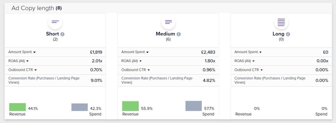
Advertisers go through lots of testing to know what length best suits their Facebook ad campaigns. Some audiences respond better to single line-post texts while others prefer paragraphs in the post text area.
Also, many ads use emojis to emphasize, express, and add flavor to the primary text. Emojis are great attention-grabbers, and you should try them out in your ads if they fit your brand tone.
Pro Tip: Including links to your website or landing page in the primary text can help you increase outbound CTR and traffic to your site.
No worries, though. You have more than the post text to think about when studying the anatomy of a Facebook ad. In Facebook ads, it’s advisable not to put all your eggs in one basket.
2. Creative
We told you not to put all your eggs in one basket for a reason. It’s because our brain processes visual information faster than it processes text. Your post text may be the best line of text you ever came up with, but it won’t be generating the engagement and ROI you’re aiming for without a spot-on ad image or video to back it up.
That’s why you should make it as appealing as you can without being overbearing. Of course, you’d want to put the most beautiful and eye-catching creative on your advertisement, but you need to consider a lot of factors to make sure the ad creative goes smoothly with everything else in the ad.
To make sure the creative element you’re going to add to your ad campaign hits the right spot, you should know what your audience wants to see and the message you want your ad image to convey. Knowing your audience means you know what provides value to them. Once you get that, you’re off to making sure the creative oozes with the value they’re looking for.
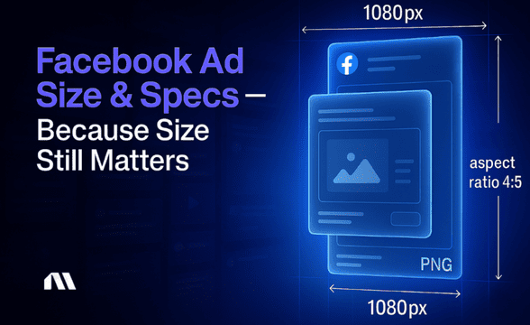
Now, how can you make sure your grip on their attention stays strong? Ensure quality. Make it a point to put out creative elements that aren’t blurry, grainy, too dark, too bright, or anything that screams bad image quality. For example, for most placements, it is recommended to use a minimum image size of 1080x1080 pixels.
Here’s a quick guide to Facebook ad creatives from the Facebook ad experts at Madgicx that will help you check a lot of boxes in ensuring creative quality.
Using video creatives is a great way to drive even more engagement and a higher CTR. When you add videos, you have to consider their length, quality, and how they’ll suit your ad objectives. Will a short, medium, or long video suffice or be too much to tell your story? Here’s how you can ensure that your video ads have the power to convert.
3. Headline
Because your headline is one of the parts in the anatomy of a Facebook ad that will do a lot of the convincing, we’ll pay extra attention to how you can write high-converting ones. Your advertisement’s headline is more often than not located below your creative. It’s the bigger and bolder line of text right below that will drive engagement.
Pro Tip: You’re only allowed to use up to 27 characters in your headline, so be concise and make every letter count!
Excellent headlines combine creativity, a sense of urgency, and CTAs in a single line of text. It sounds like a lot of investment in a single sentence, but you should know that it’s the most prominent line of text within your ad and will catch the attention of people who go by your Facebook ad.
The value your product can provide should emit from this line of text, which isn’t a big deal if you’re aware of what value you can propose to your potential customers. A headline isn’t like a post text -- it needs to be short, clear, and catchy. You should spark inspiration, interest, and subsequent action using a single line. Using emojis can help you grab attention and add in some attitude.
Get their attention and make sure you lead them into making the click on your CTA button. You can make use of emojis pointing at your magic button or write a headline complementing your CTA button. Those things will help you secure clicks.
4. Link Description
Sitting right under your Facebook ad headline is the description. This is your chance to tell your audience more about your business or offer. What other value can you provide that wasn’t implied in your headline? Why is the value you’re proposing worth the call-to-action button click?
Depending on your advertisement objectives, you can cover more information about your product in this part. Some Facebook ad examples have pricing, best features, and geotagged information written in their ad description.
What’s the biggest function of your Facebook ad description? It sits right next to your CTA button. So, it wouldn’t hurt to tell people what they’ll see after they act on your CTA. Your target audience may be more willing to click on your links if you tell them what to expect when they do it.
5. CTA button
You already had your glimpse of what a call-to-action button is and how much value it adds to your Facebook advertising efforts. To people engaging with your ad, this button will lead them to where your ad is aiming for them to reach.
In Facebook advertising, you get various options for your call-to-action button. There’s Shop Now, Learn More, Download, Sign Up, Subscribe, Contact Us, or Use App if you're promoting mobile apps. It’s best to use the proper words depending on your ad’s goal. Do you want sign-ups? Purchases? Then be clear about that.
With CTA buttons being the gateway to getting people to engage more with your brand, it’s important to note that they should be anchored to links that work 100 percent of the time. You don’t want your ad to catch someone’s attention only to lose them because of a link that’s down, slow, or can’t be found. Such customer experience might also harm your Facebook Customer Feedback Score.
Types of Facebook ads
In the world of Facebook ads, there are things defined uniformly other than the anatomy of a Facebook ad. Those things include types of Facebook ads, which can be identified according to two factors -- ad formats and ad placements.
Ad Formats
After finding out your ad objectives and ad strategy, you can move along with selecting the right Facebook advertisement format. The available formats on Facebook are:
- Single Image ads
- Single Video ads
- Carousel ads
- Instant Experience ads
- Collection ads
- Slideshow ads
Different ad formats can be found in different ad placements. You’ll read more about the latter in the next section.
Each format has specific targets and design specifications that come with it. Here’s an in-depth guide to every Facebook ad format there is. It would tell you all about ad objectives, image, and video specs, and post text limits.
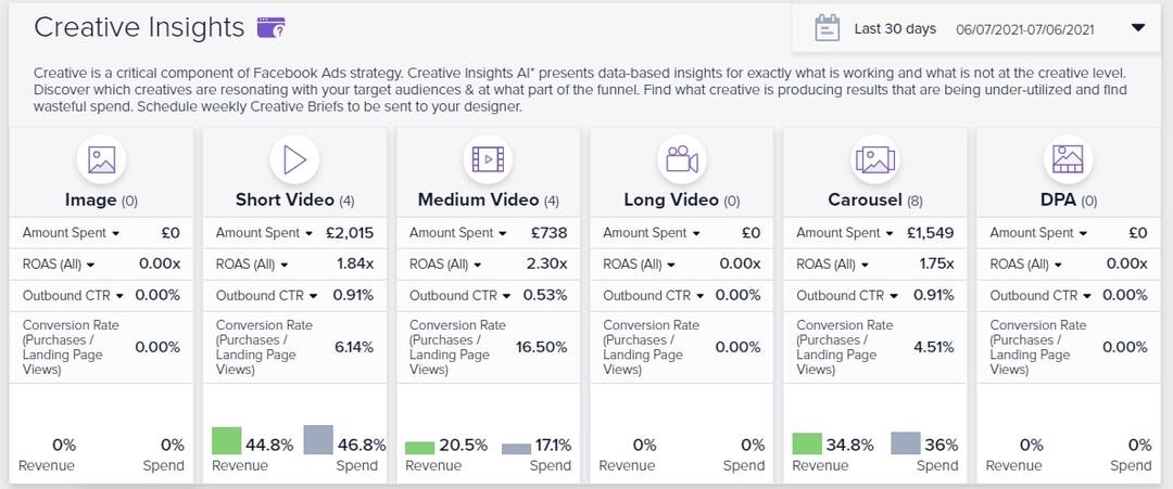
The effectiveness of each format depends on your ads. Here’s where a lot of testing comes in. During testing, you use different ad formats to find out which one works best for your target audience. To some, a medium-length video ad works well while short-video ads don’t drive a high ROAS.
Ad Placements
Putting your ads up in the right spots on Facebook combined with a suitable ad format can help you come out with excellent turnouts. Determining your ad placement and ad format will let you apply what you’ve learned in the previous sections.
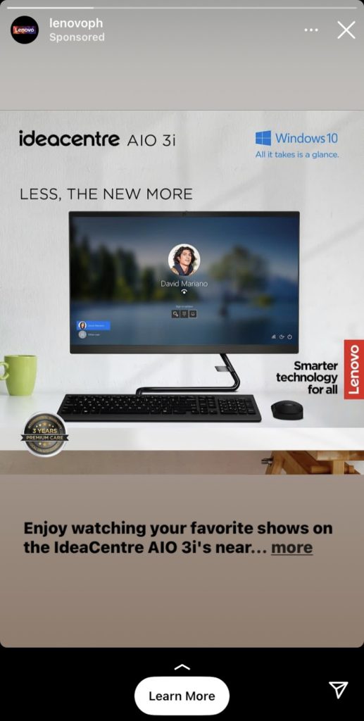
While working around Facebook ads, you’ll have the opportunity to select where you want to show your ads in different places within the platform. For example, you can place your ads on Facebook and Instagram Newsfeeds and within Messenger. You can place them as Right Column ads, Story ads, or Audience Network ads.
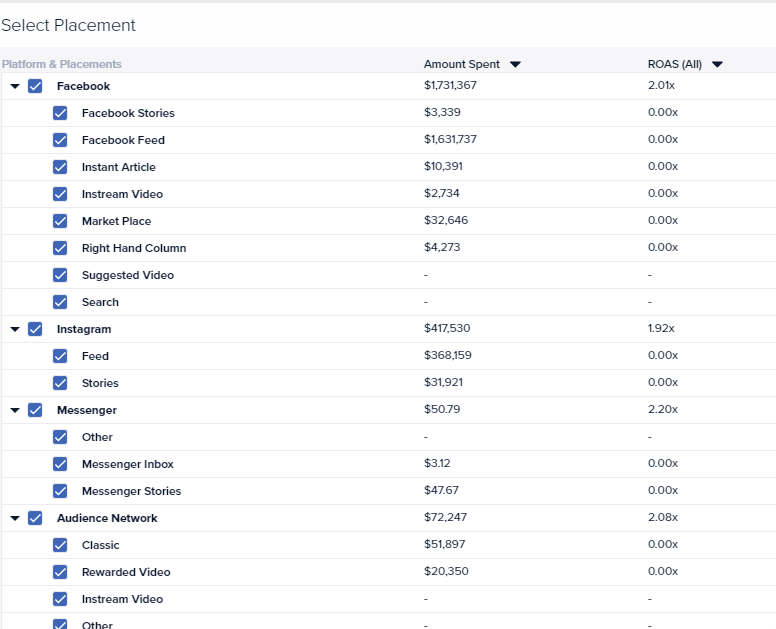
When starting with Facebook ads, it’s highly recommended to begin with automatic placements. Automatic placements show your ads in places they’re likely to perform best according to Facebook’s algorithm. These placements may include Facebook, Instagram, and Audience Network.
After gaining enough knowledge on what placements help your ads perform the best, you can begin manual selection. To help you delve deeper, Madgicx came up with a good handbook for Facebook ads placement.
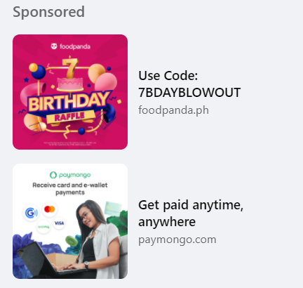
Once you familiarize yourself with ad formats and placements, you’ll figure out where your ads garner the best results. The last thing you want is to implement an ad campaign with the wrong ad format and placement. This will end up costing you money that should be poured into a better Facebook ad campaign.
3 excellent Facebook ad examples
After test runs, some advertisers, who followed the anatomy of a Facebook ad, have already figured out what works for them. We’ve gathered some examples that’ll help you find out what a good Facebook ad looks like.
1. Hendrick Automotive Group
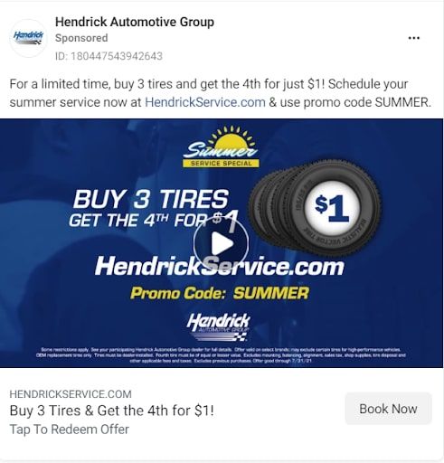
This tire ad can surely catch a car owner’s attention. A spare tire for a dollar? Who wouldn’t take a look and click the “Book Now” button?
Aside from the excellent proposal, the advertiser didn’t miss their chance to insert a sense of urgency. The “limited time” part urges customers to make a move before the $1 for a tire disappears. Even though you have to pay the full price for the other three, you know the fourth tire for a single dollar sounds like a steal.
2. The Computer Warriors, Inc.
.jpeg)
The creative says it all -- a computer that’s acting up can really stress you out. When you’re in a rut because of a broken PC and see this ad, you’ll surely feel relief wash over you. There’s a free PC health check offered, but it’s not forever. This is another reason for you to click their “Get a Quote” button.
We can see them using emojis as bullet points -- colored and eye-catching. They capitalized on catching your attention by telling you how good their technicians are.
3. Christner’s Prime Steak & Lobster
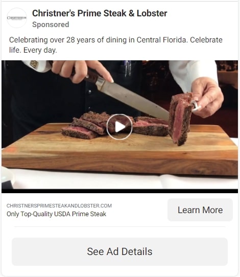
This steakhouse ad looks the way it was intended to look -- appetizing. They’re telling you that they only use the best quality of steak, which is enough to spark your interest.
Are they good? They should be -- they’ve been in the business for 28 years. That’s how they create authority on cooking the best steak, which makes them worth the bite.
For more examples, check out these blog posts:
- The 16 Most Inspiring Facebook Ad Examples of 2022
- 9 Facebook Video Ad Examples That WOWed Us in 2022
Key takeaways
Telling you all about the anatomy of a Facebook ad isn’t the sole purpose of this article. We’ve also given you a preview of how different ad formats and ad placements can affect your ROAS. Are you looking to implement your first-ever campaign or want to improve? This article should be a good guide into what will make your ad campaign high-performing.
Working with the right team of copywriting professionals, media buyers, graphic designers, and others that make up the bunch should also be of huge help. They’re essential to the advertising industry for a reason.
Keep in mind that you can’t just put all your content in a single format or placement. This requires a lot of testing, which can cost you a significant amount in ad spend. Putting your ad out should be planned accordingly, hence the importance of Facebook ads management tools.
Running poor creatives can result in high CPMs, wasted months of testing, and more. Use Madgicx’s Creative Suite to ensure your ad production workflow can bring you maximum profits starting today.
Natalie values content writing as a way to inform and ask people questions. To her, posing questions spark her own and others' curiosity and encourage learning.


.avif)


