Discover how to make Facebook carousel ads with this step-by-step guide. Plus, learn tips for creating, optimizing, and using carousel ads to boost engagement.
Are Facebook's carousel ads still a thing? You bet! They’re far from obsolete. These interactive ads offer a fantastic way to showcase multiple products or tell a story, making them a consistently powerful tool for your marketing toolkit.
Open wide; you’re about to get the big scoop on Facebook carousel ads.

What are carousel ads?
Carousel ads on Facebook allow you to showcase up to ten images or videos within a single ad, each with its link. This format lets you highlight multiple products, services, or features, making it perfect for storytelling and providing your audience with a more interactive Facebook ads experience.
Are Facebook carousel ads effective?
Absolutely! Carousel ads are known for their high engagement rates and versatility. In fact, carousel ads get 30% more clicks compared to video ads and 34% more clicks than single-image ads.
If you want to showcase multiple products, feature a different product on each card that links to its landing page. That will give potential customers more options and help raise your click-through rate. To highlight the features of a single product, use each carousel card to show different product angles or details, better informing customers.

To encourage active engagement, tell a compelling story that develops across cards—the interactive format encourages people to swipe through for more. And if you need to explain a process, give people a step-by-step tour of how your business or product works.
How to create a carousel ad on Facebook
Ready to give it a shot? Here’s a step-by-step guide to creating your first carousel ad:
- Go to Meta Ads Manager and click ‘Create campaign.’

- Choose a campaign objective that aligns with your goals. Note: You can’t use the engagement objective with the carousel format. Then, click ‘Continue.’

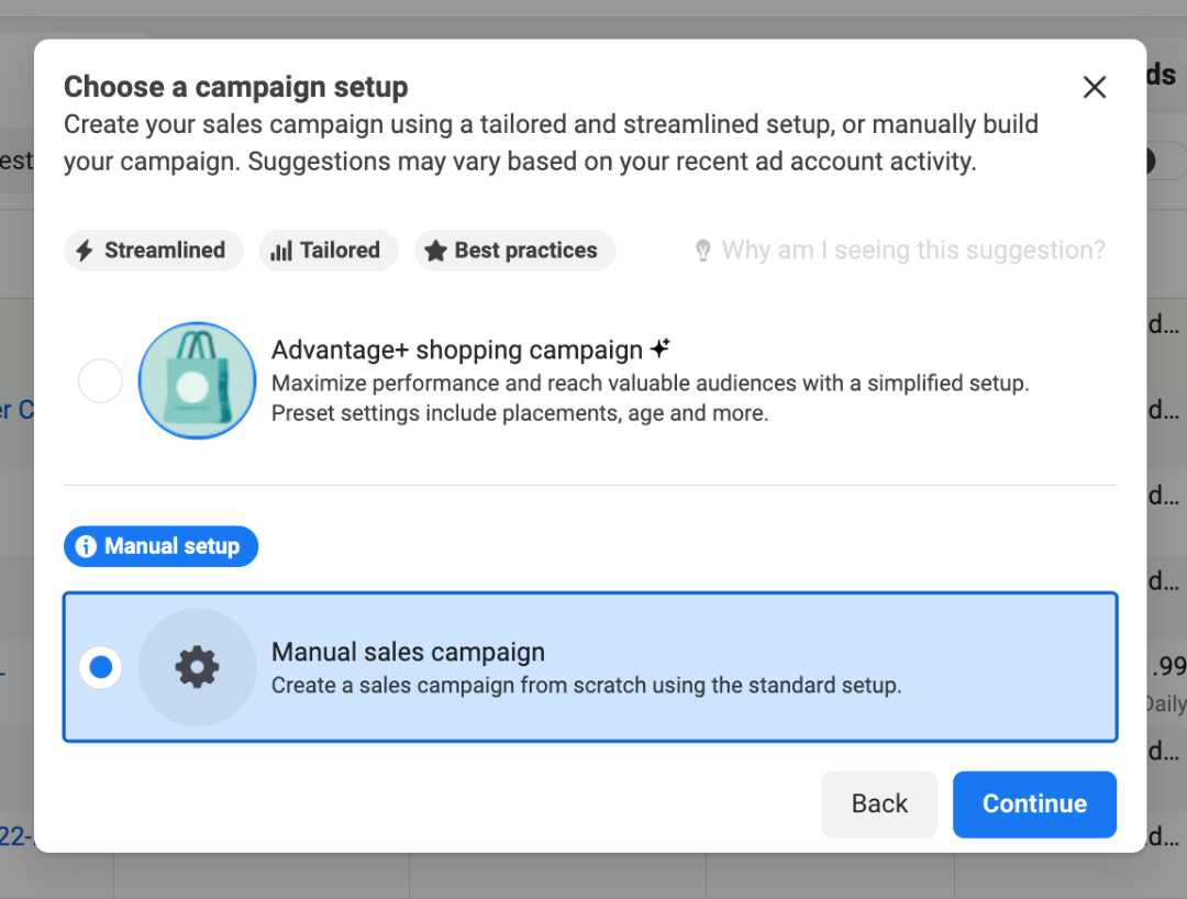
- Choose between an Advantage+ shopping campaign setup or building your campaign manually.

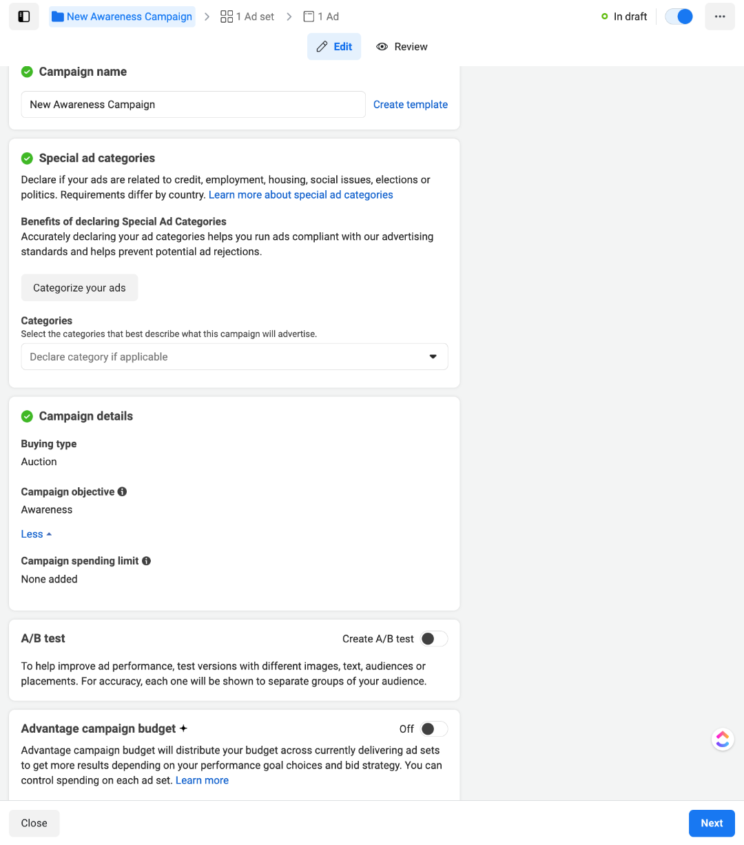
- Add your campaign details. If you'd like, you can toggle on A/B testing or Advantage campaign budget. Once you're ready, click ‘Next.’

- Select your conversion location, a performance goal, and a conversion event. Also, ensure your Meta Pixel is active so you can track conversions from your ads.

- Set your budget and schedule.

- Ensure the audience location is correct. You can also automatically allow Meta to find an audience according to your audience suggestion. Once you’ve done this, tap 'Next.'

- Check that you’re setting the carousel ad under the correct social media pages. Under ‘Creative source,’ you can choose between a manual upload or using media from a catalog. In the ‘Ad setup’ section, select ‘Carousel’ as your format.

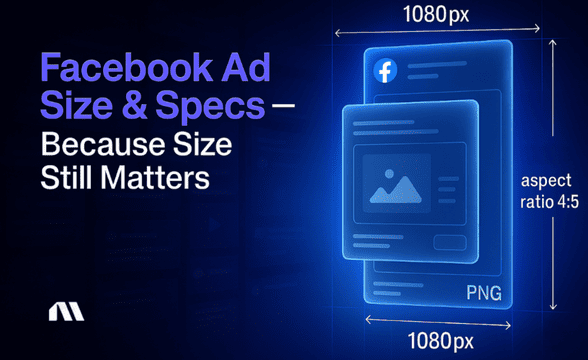
- Click ‘+ Add cards’ to upload your media. You can select multiple images or videos at once. Be sure to check Meta’s design specifications.

- If you choose ‘Catalog,’ pick an option from the catalog dropdown. Select your product set from the ‘Product set’ dropdown.

- Decide whether to promote multiple products or categories in your carousel cards.

- To edit your catalog carousel card, click ‘Catalog’ and choose from the category options. Then, add your headline and primary text, and select a call to action. To add another carousel card, simply click ‘+ Add card.’

- In the ‘Tracking’ section, add the relevant information where applicable. Once done, click ‘Publish.’

Once your carousel ads are live, use Madgicx's Creative Insights tool to identify which ones drive the highest revenue and which ones have scaling opportunities and spot those that may need less budget. This allows you to refine your ad strategy and focus on your best-performing content for future campaigns.

Use cases for carousel ads
Their versatility and engagement potential make them a must-have in your marketing toolkit. Here’s how you can milk carousel ads to their full potential:
👉 Show off multiple products
Got a range of different products? Feature each on a separate card, each linking to its landing page. This approach gives your customers more options and boosts your click-through rate.
👉 Highlight features of a single product
If you want to showcase one product's different angles or features, use each carousel card to highlight a unique aspect. That will give your audience a comprehensive view and help them make informed decisions.
👉 Encourage active engagement
Tell a compelling story that unfolds across the carousel cards. This interactive format keeps people swiping for more, increasing engagement and interest in your brand.
👉 Explain a process
Break down a process step-by-step across multiple cards, whether it’s how your product works or a service you offer. This method makes complex information easy to digest.
👉 Promote events or offers
Use carousel ads to highlight different aspects of an event or various offers. Each card can provide unique information, enticing your audience to learn more and take action.
4 tips to create fantastic carousel ads
Alright, let’s look at how you can make some kickass carousel ads with these best practices:
#1 Use only the number of frames you need
Don’t waffle! Facebook gives you up to 10 frames to work with. But just because you have that many doesn't mean you need to use them all. Stick to the number of frames you need to get your message across effectively. Less is often more, and a clear, concise ad can be more impactful than one overloaded with information.
#2 Don’t crowd each frame
You've got limited space in each card to capture attention and deliver your message. Overloading a card with too many elements can confuse your audience and hurt your ad's performance. Keep it simple and focused for the best results.
Look at these two ads. Isn’t the ad on the right easier to digest?

#3 Choose your fonts wisely
When designing carousel ad frames, readability is critical. Use clear, easy-to-read fonts, and pay attention to line spacing. Mobile users have limited screen space, so your text needs to be legible at a glance. Hard-to-read fonts or poorly spaced text can detract from your message and hurt your ad's performance.
#4 Test your creatives
A study by Databox found that 67.55% of Facebook advertisers say videos drive more ad clicks than other ad types. By testing different creatives, you can see the perfect mix of images and videos that delivers the best results for your campaign goals.
Facebook carousel ads examples
Let’s look at these real-life examples that showcase the versatility and impact of Facebook carousel ads.
1. Sneakr

As we’ve mentioned, Facebook carousel ads are perfect for showcasing every detail of your product. The best part? The time constraints of video ads do not limit them. You can focus on creating up to 10 high-quality, crisp close-ups that highlight your product.
2. Kaapi Solutions

Kaapi Solutions further takes the image carousel concept by incorporating elegantly crafted icons on each card to showcase its unique selling points. With these icons, they packed a lot of information into their carousels without resorting to expensive creative production.
3. Earth Rhythm

If you’re in the education, beauty, wellness, or even legal sector, carousel ads let you create shareable guides tailored to your target audience. They’re perfect for breaking down complex information, showcasing step-by-step tutorials, or highlighting a series of products, all within a single, interactive ad format.
Earth Rhythm uses a neatly organized carousel to highlight eight skincare mistakes to avoid. Spread across two cards, they use a continuous line as a visual thread that guides the eye through each step and ties the cards together. Carousels like this can captivate your audience and encourage them to save and share your content.
4. Exclusive Markets
Speaking of breaking down information, Exclusive Markets took advantage of the video capabilities of carousel ads to showcase the results of their top copy traders of the month. They delivered this information across three video cards, each featuring a 6-7-second simple animation.
Carousels are a great way to deliver your message in a relaxed way using bite-sized snippets. With seven carousel cards left, they had plenty of space to share more videos if they wanted to.
5. Holzsche Furniture

Holzsche Furniture creatively splits its table image across two carousel cards, encouraging users to swipe through and stay on the ad. You can apply the same strategy with text, dividing your message across the cards to maintain interest and guide users through your ad content. Just maintain consistency by keeping all cards within the same color theme so it feels like a cohesive story unfolding.
Looking for more Facebook ad examples?
- Real estate ads
- Clothing ads
- Jewelry ads
Eager to make your own stunning Meta ads? 🤩
Bringing your carousel ads to life just became easier with Madgicx’s AI Ads Workflow. Here’s how:
Madgicx’s AI Ad Generator instantly creates bold, high-quality image ads that are ready to slot into your next carousel. Simply upload a product image or a past top-performing ad, or browse Madgicx’s Ad Library for inspiration, and let AI do the rest. It generates multiple ad variations in one go, so you can pick the best ones for your carousel.
If you want to fine-tune some ad details, the built-in AI Editor lets you adjust elements, remove what you don’t need, and add text for a personal touch.
Why wait? Start creating top-performing ads today with Madgicx’s 7-day FREE trial!
Carousel ads FAQs
Lights, camera, FAQs! It's time to tackle the burning questions about carousel ads.
What is the difference between carousel ads and image ads?
Carousel ads allow you to showcase multiple images or videos within a single ad unit, each with its link. This highly engaging format encourages users to swipe through to see more, making it ideal for storytelling and showcasing product features. It’s versatile and aligns well with creative strategies focused on detailed, interactive content. In contrast, image ads feature a static image or graphic with a direct link, which can be effective for straightforward messaging but offers less flexibility for creative exploration.
How does Facebook charge CPM on the carousel ad format?
Facebook charges CPM (Cost per thousand impressions) based on how often your carousel ad is shown to users, regardless of whether they interact with it. This pricing model helps advertisers reach a broader audience and can increase brand awareness effectively.
Do carousel ads convert better than single-image ads?
If you want to increase your ad clicks and sales, carousel ads are your best bet. They boast a solid 10% higher likelihood of converting than single-image ads.
Madgicx’s AI Ad Generator makes ad creation effortless, delivering high-quality ads in seconds. Transform a simple product image into a scroll-stopping ad, refresh top-performing creatives, or explore Madgicx’s Ad Library for inspiration—AI will generate multiple ad options for you instantly.
Digital copywriter with a passion for sculpting words that resonate in a digital age.


.avif)


